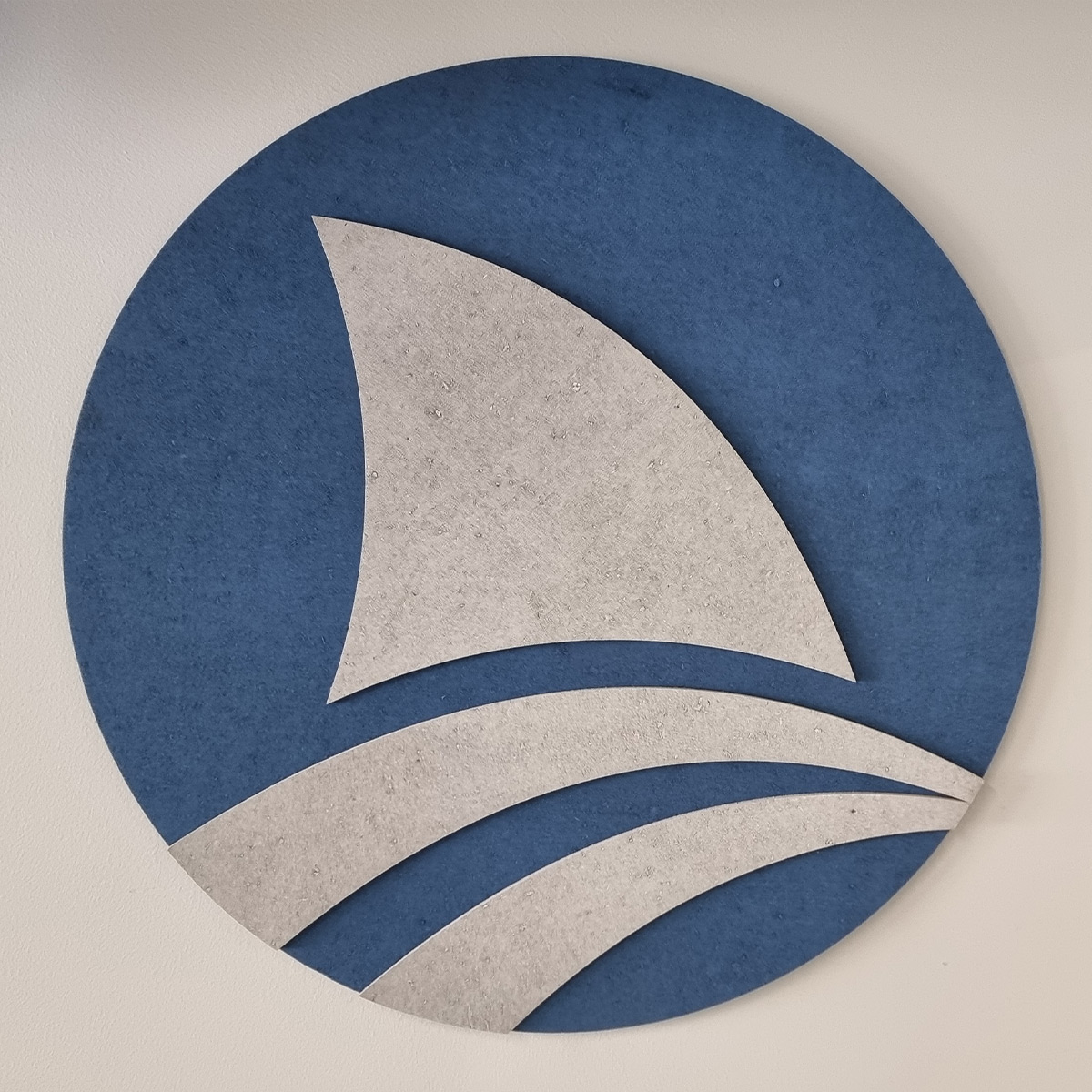
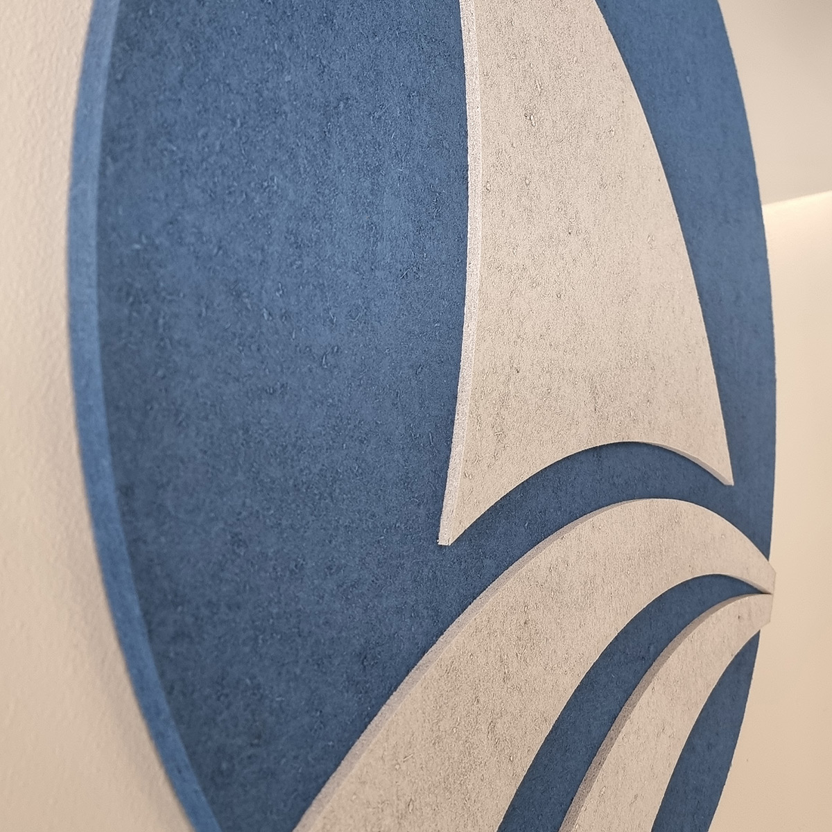
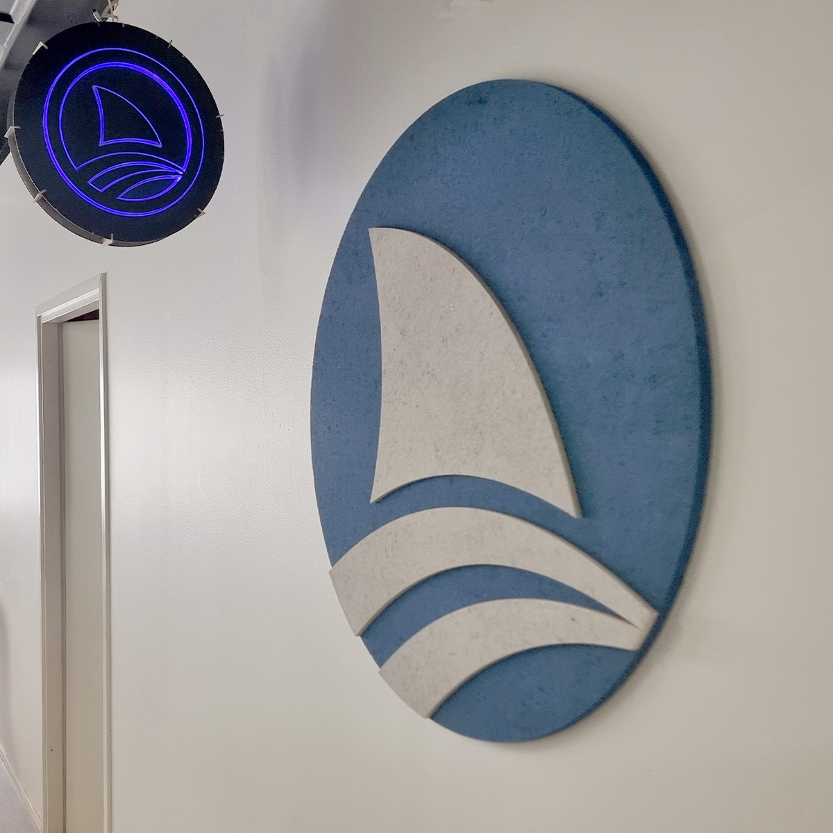
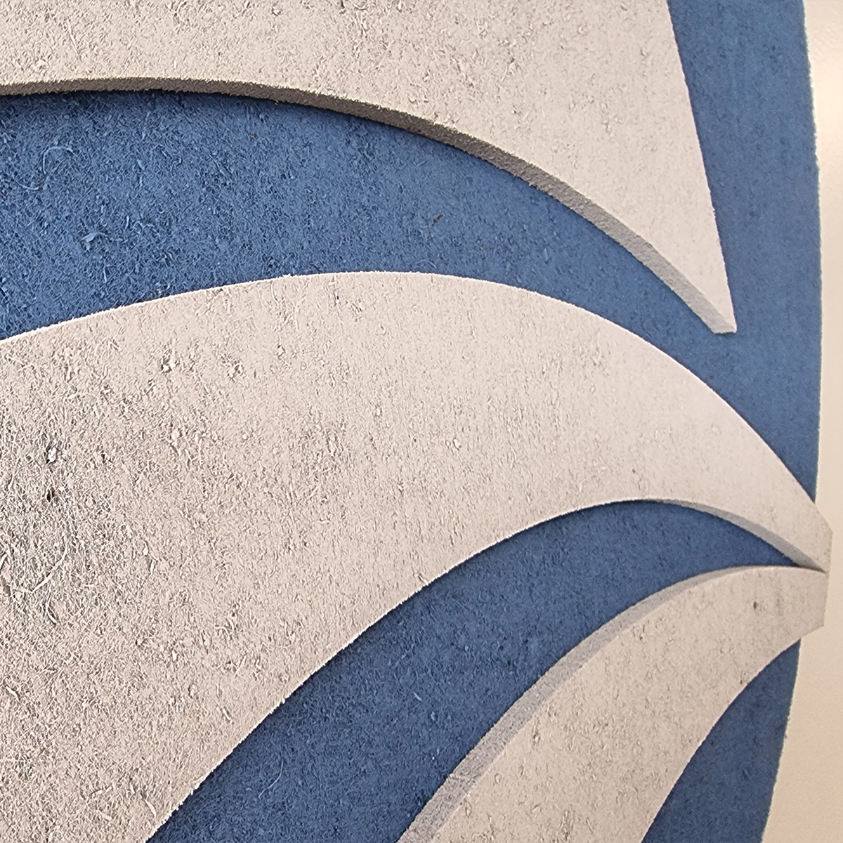
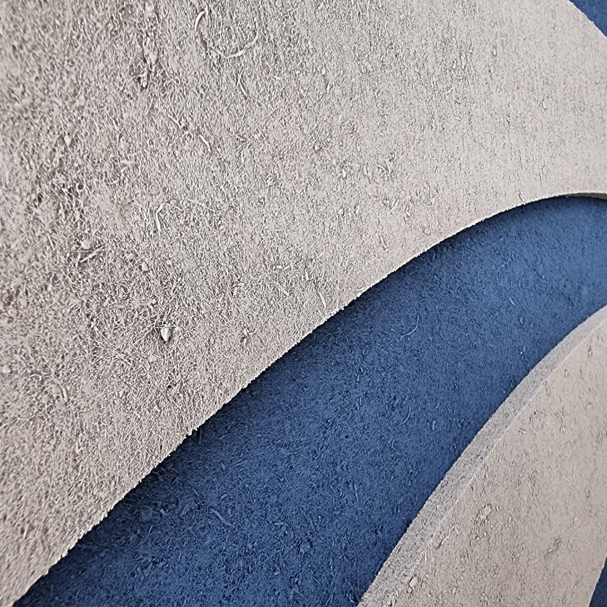
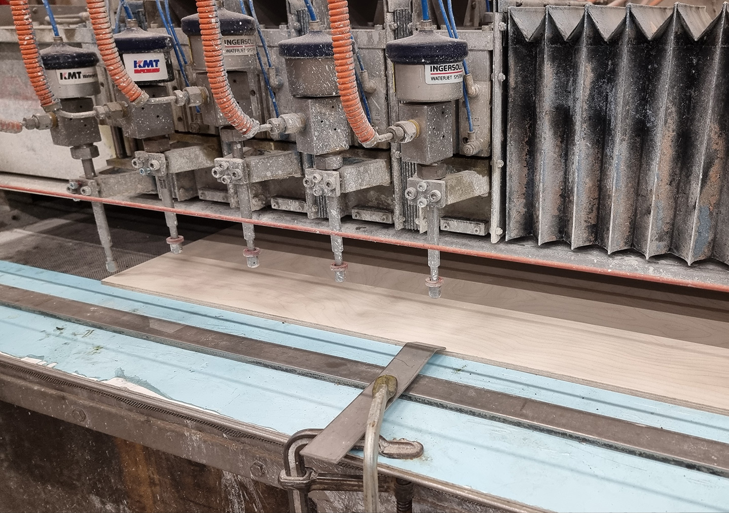
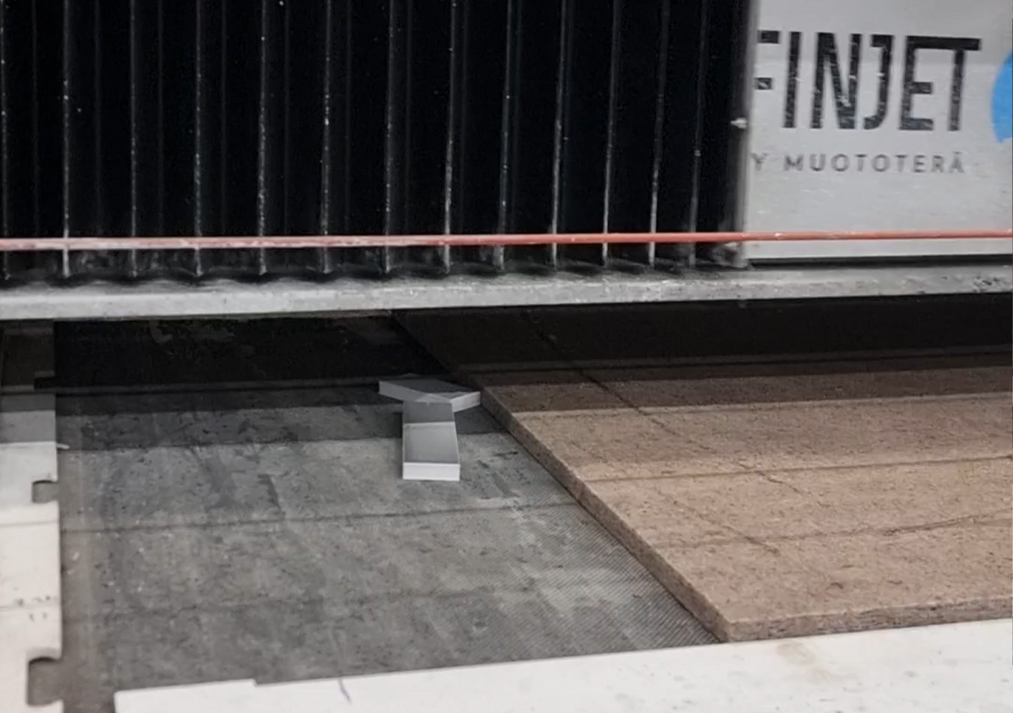
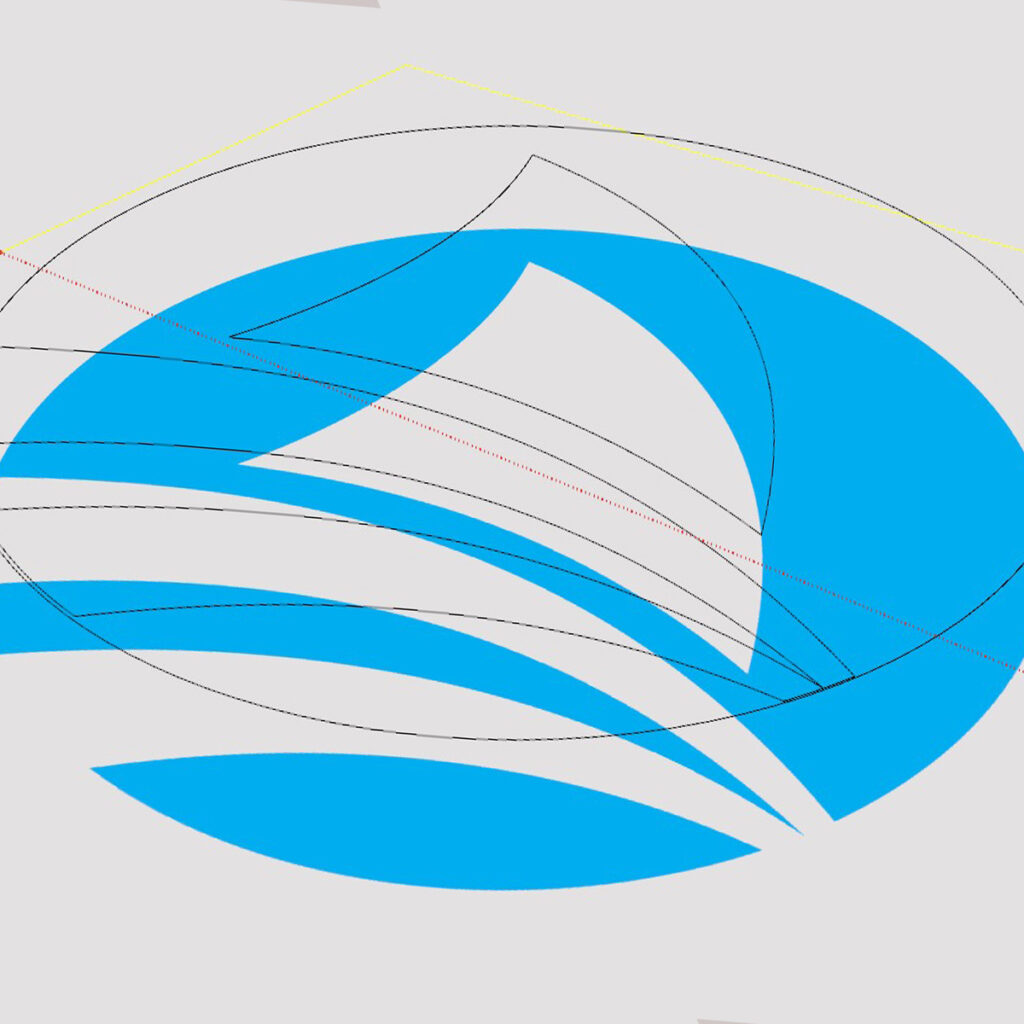
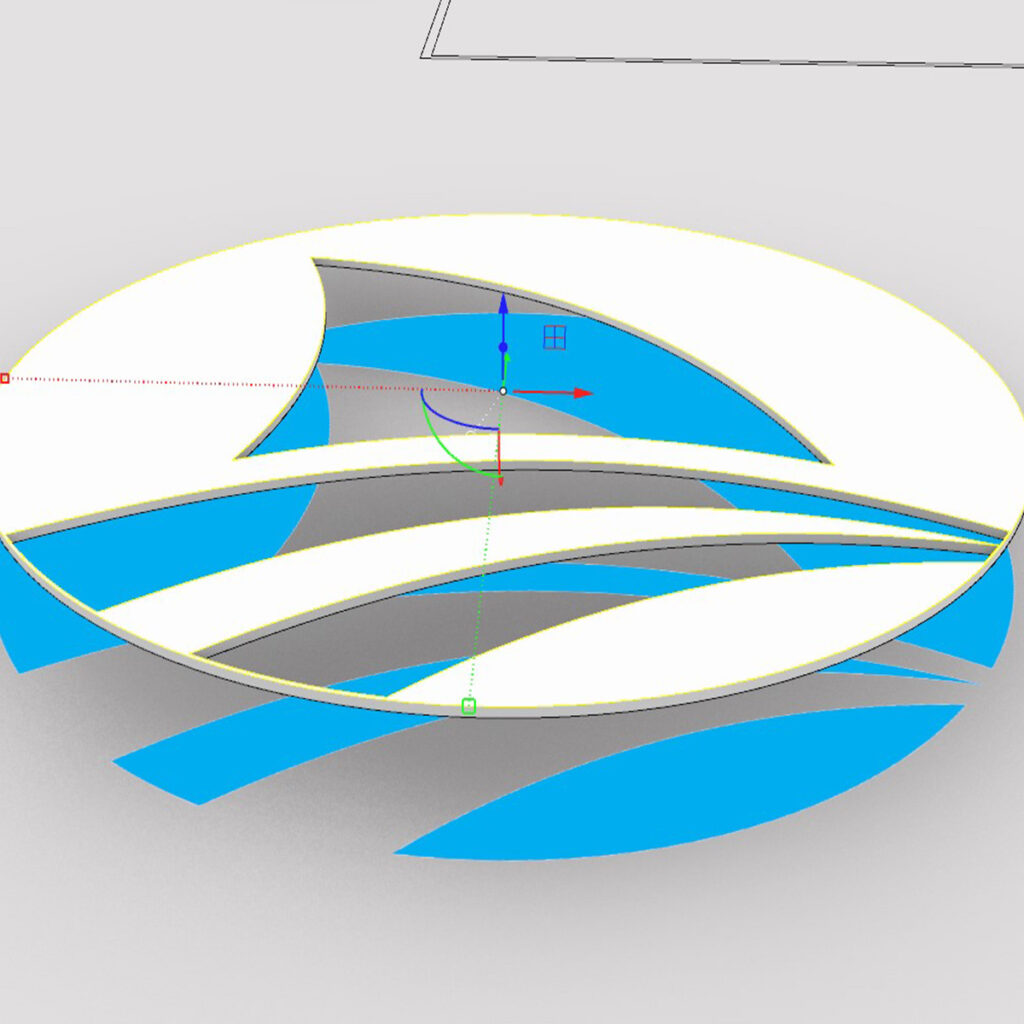
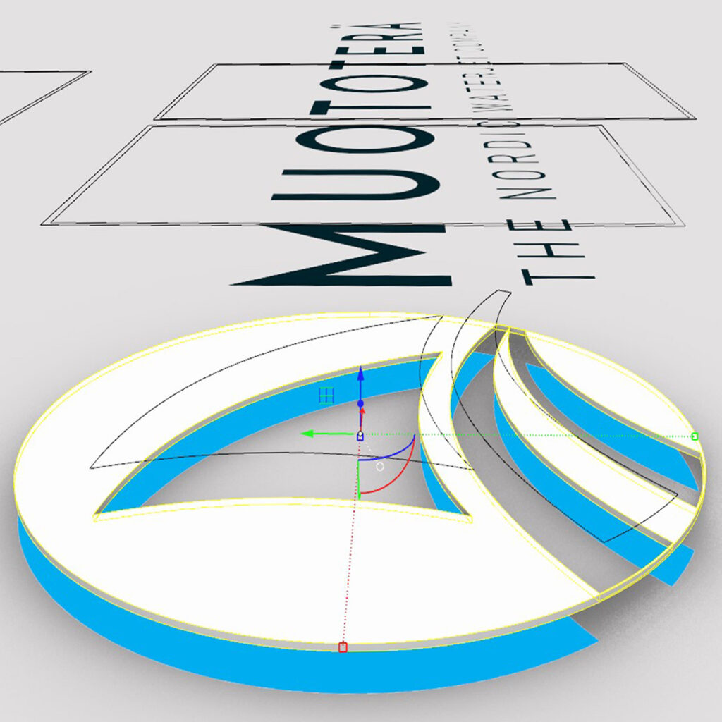
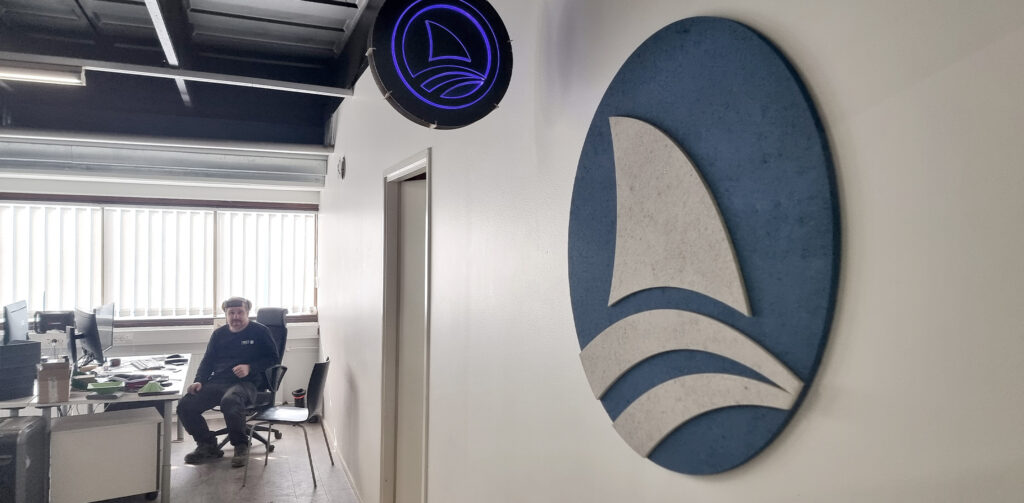
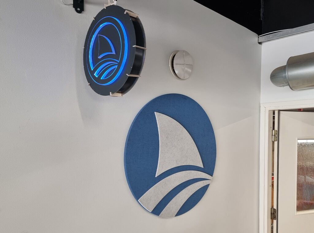
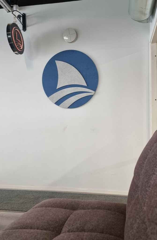
Translating the Muototerä logo into a tactile wall piece was an exercise in clarity, proportion, and material sensitivity. I chose Konto acoustic board for both its texture and visual weight, knowing it would bring a quiet but confident character to the interior space.
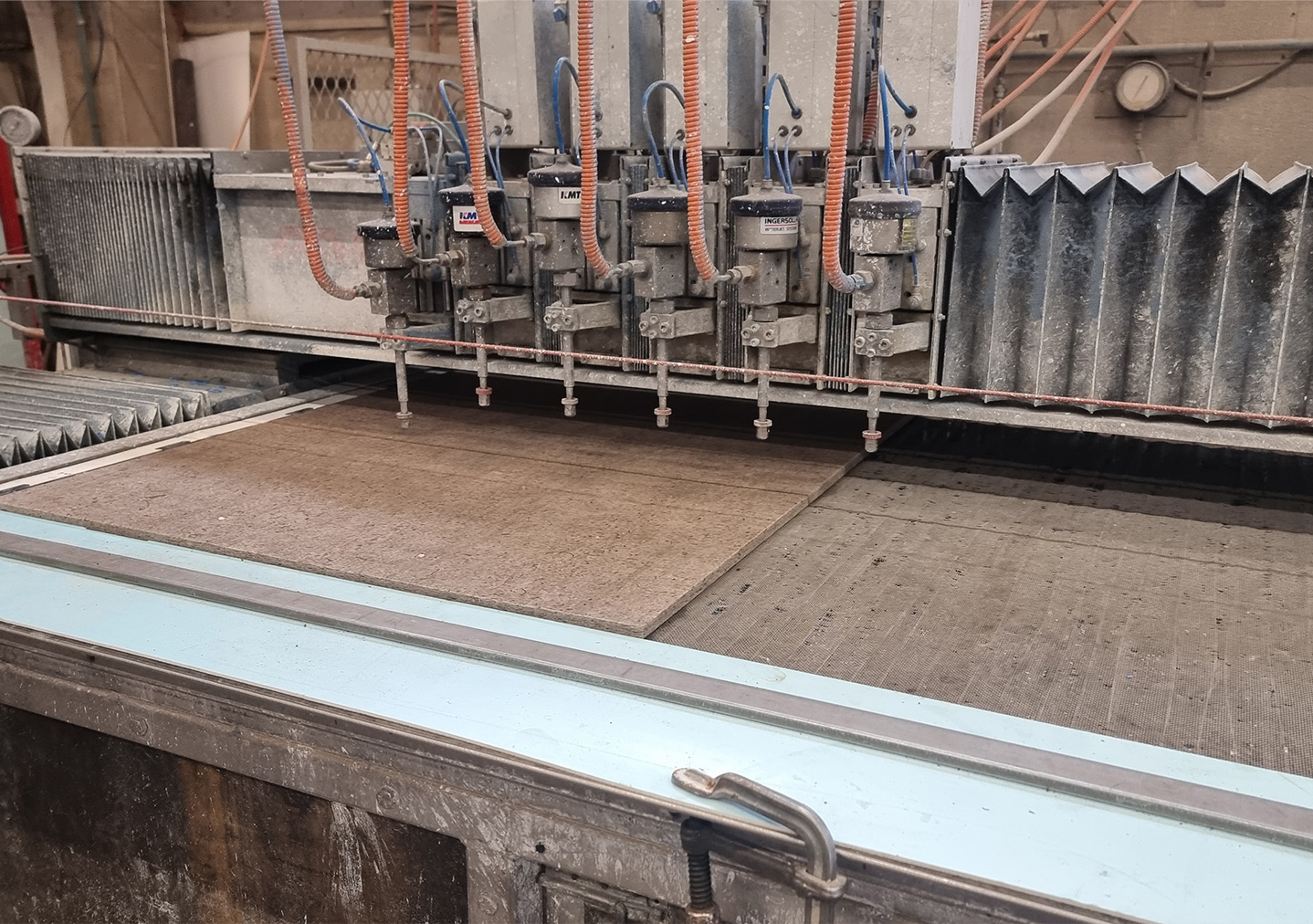
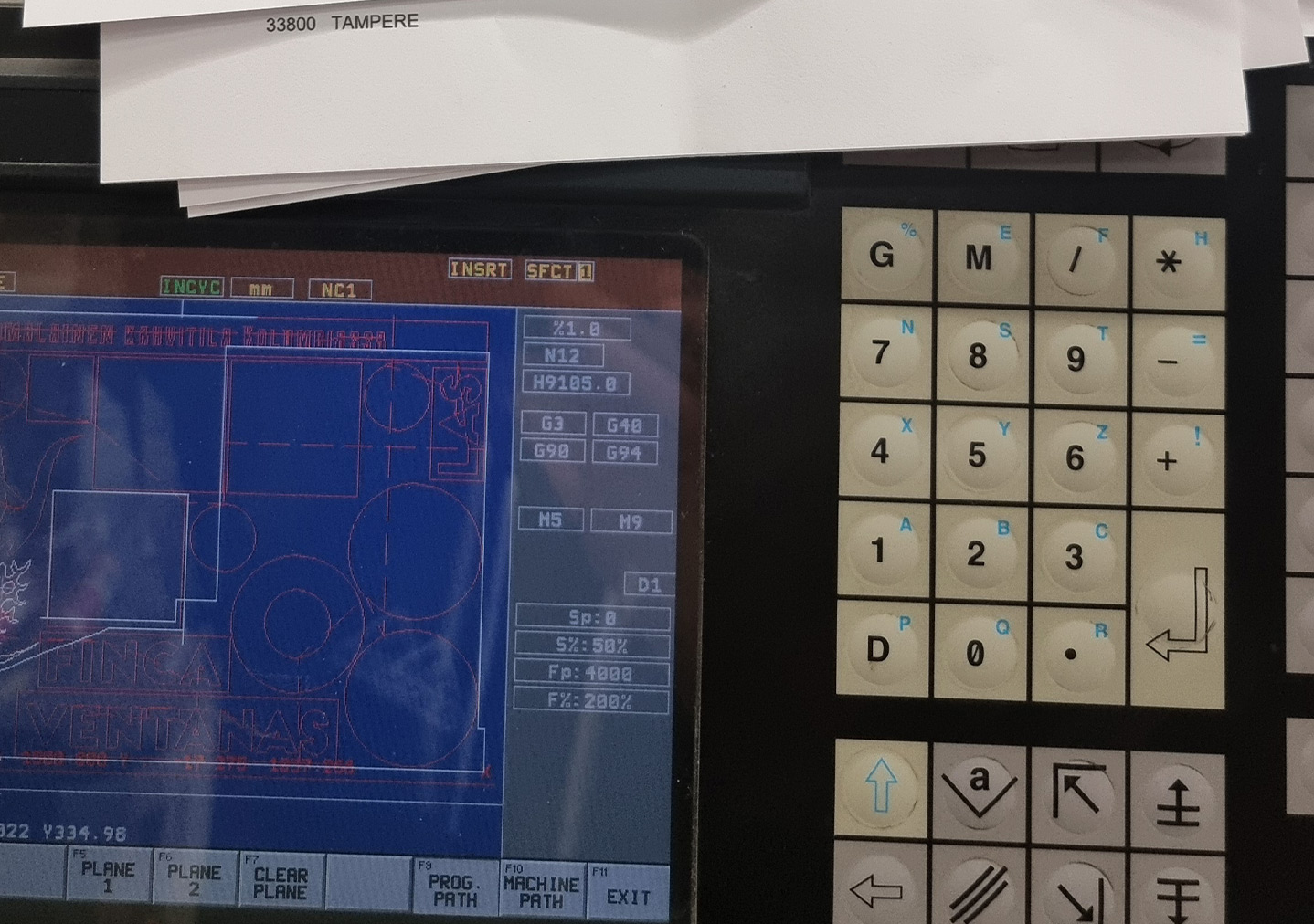
The curved white elements were precision-cut to preserve the crisp, dynamic energy of the original design, while the layered blue background creates depth, presence, and a subtle sense of movement without becoming intrusive. Careful attention was given to clean alignments, controlled shadow play, and a measured physical separation between layers to let the form breathe and maintain visual clarity from multiple viewing angles.
The final result doesn’t only reproduce a logo. It transforms it, giving the mark a tangible volume, a measured rhythm, and a calm, architectural presence that feels integrated into the space.